This is a piece contributed by Masons Home Décor with some useful tips.
photo from Skitterphoto
The living room is often the most lived-in room in the home. In Singapore, it is also the room that often suffers from common design mistakes with regard to the arrangement of your furniture.
Keep reading to identify the mistakes you may be making, why what you’re doing doesn’t work and how to make some effective changes. Most of these problems are fairly easy to fix, and a few tweaks can make all the difference.
1. Pushing furniture against the walls
Pushing all the furniture against the walls gives the room a very formal atmosphere and creates an empty space in the center of the room. You may be trying to make the room look larger, but instead, the arrangement limits useful space and has a feeling of being off-balance.
Don’t use the walls as your guide. Rather choose a focal point like a feature wall or the wall where your television would be placed at and focus your arrangement around that point. Think about people wanting to have cozy chats and create intimate, seating spaces. It will immediately give a space a more lived-in feel.

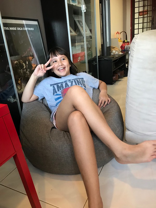
The inclusion of a bean bag in Singaporean homes is becoming increasingly popular today for all the obvious reasons. Aesthetically, it is able to effectively add more colours into your space to boost the overall décor of your home. At the same time, it provides the perfect comfort and casual atmosphere needed for a gathering.

The inclusion of a bean bag in Singaporean homes is becoming increasingly popular today for all the obvious reasons. Aesthetically, it is able to effectively add more colours into your space to boost the overall décor of your home. At the same time, it provides the perfect comfort and casual atmosphere needed for a gathering.
Most living rooms will have one main grouping, but if your space is larger, having a secondary seating area such as a reading nook where your bean bag can be placed would be ideal. What’s important is that each piece of furniture feels as though it has been purposefully placed.
2. Hanging art too high
Singaporeans tend to hang their photo frames far too close to the ceiling. At this height, it is above eye-level and loses its impact. It also loses its proximity to other elements like furniture and forms a less coherent whole. Too high and too small are common mistakes made when hanging artwork.
The center of the piece should be at eye-level. Measure up from your floor and make a mark at 57” on the wall. (57" represents average human eye-level). If your artwork is 20 “tall, 10” is the midpoint. It’s this midpoint that has to rest 57” from the floor, so you also need to measure from the tight wire to the top. If this is 2”, you need to minus this 2” from the 10”.
Make a mark at 8” above your 57” mark (65”), and this is where you need to hang your picture. This may seem complicated when you read it, but it is easy to do. It means that the center of all your pictures is at the same 57” above floor level.
3. Using area rugs that are too small
As seen in online furniture stores such as Masons Home Décor, a big rug can be expensive and may feel like a big commitment. People may pick a smaller rug that they think will be big enough but it may look as though it’s sitting in the middle of nowhere. A rug in the living room needs to ground the seating and tell everyone where the conversation is happening. When it’s too small, it makes the room feel disjointed and cheapens the whole appearance.
A general rule is that the rug should touch the legs of each piece of furniture standing nearby. If it’s bigger than this, that’s fine too!
Interior designers usually use a 2:3 ratio when arranging furniture to make it aesthetically pleasing. For instance, a coffee table should be two-thirds the length of a couch, and a couch should be two-thirds the width of an area rug. Each component of the room varies in size but together create a balanced effect.
4. Forgetting about layering
A living room can become more functional than having any aesthetic appeal. It may be the space where you kick back and relax, but it can lack visual interest. You don’t have to try to layer a room all at once. It’s easier to build up layer by layer over time.
Effective layering is a way to create a more sophisticated look. You need to think about lighting, wall coverings, window treatments, artwork, furniture, and flooring. These elements must provide the right combination of shapes, sizes, texture, and color.
Start by purchasing the right area rug and work up from there. Window treatments add softness and texture. Cushions are an affordable way to add color and a personal touch to a room.
Patiently place your large pieces of furniture, thinking about proportion and balance. Small pieces of furniture like footstools, small tables, baskets and trunks all add interest and comfort. Choose small pieces that are functional, rather than just decorative. A trunk, for instance, can provide storage.
Don’t just buy art to fill your walls but choose art with significance to you, even if you have to make it yourself. A collage of photos may have more appeal than a large, expensive artwork that means little to you.
It’s important to layer lighting too. Use a mixture of types of lighting and make sure it is balanced and that a room has no dark corners. A natural element or two, like blooms from your garden, make a room come alive.
---------------------------

Meanwhile, we are loving the bean bags from Masons! They are light, portable and so comfy. I'm planning NOT to have any sofas or couches for my next place. It's gonna be bean bag HQ there!---------------------------


No comments
Post a Comment